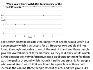
1. Wouldyouwillinglywatchthisdocumentary for thefull 30 minutes? Thescatter diagram indicatesthatmajority of peoplewouldwatchourdocumentarywhichis a success for us. Howevertwopeopledid not founditenoughenjoyable to watchtherest of it and andthreepeoplegavetheoverallmark of threebecause, as theysaid, theywouldwatch as thecontent was veryinformative but a big disappointment for them was thequality of soundwhichmadeithard to understand. For peoplewhowouldlike to watchit, itwould not be a problem as theycouldincreasethevolume (threepeopleratedit as a ‘5’ and twogave a ‘4’)
2. Do youthinkour radio advertiseffective? Thisscattergraphpresentstheeffectiveness of our radio trailer. Itshowsthatthemajority of peopleliked and appreciatedoureffortintocombiningthis piece of worktogether and this was rated as very high because no one voted for one ortwo. Peoplewholikedit most saidtheyenjoyedthevoiceover’svoice and thewholethingappearedveryprofessional and natural. Somesaidthevoicesoundsveryenthusiasticwhich was a goodthing as thiswouldengageouraudiencemore.
3. Do youthinkourprintadvertiseffective? Thescatter diagram representstheeffectiveness of ourprintadvert on thescale 1 to 5 rated by theaudience. A similarnumber of peopleliked (four) and disliked (three) theprintadvert. Peoplethatlikeditsaidit was easy to understand and to guesswhatthedocumentary will be about, theyalsosaidtheworld on the top was a clever idea, whereaspeoplewhodislikeditsaidtheimage was not lookingenoughprofessional for them and theydid not evenmentionanythingaboutchocolatesprinkles on the top creating an image of theworld (indicatingthatcoffeeis a worldwidebeverage and affectseveryone).